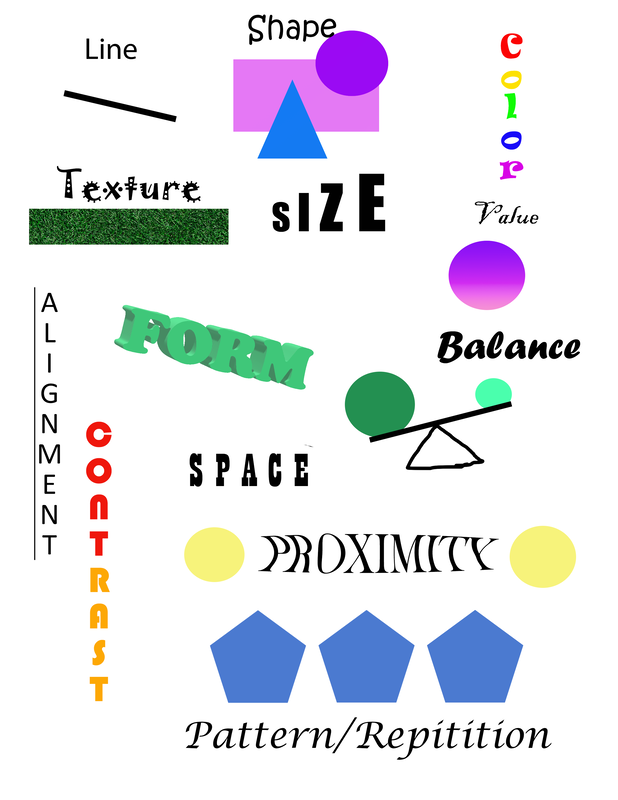
Fundamentals Practice
|
Inspiration: I feel like the inspiration for this was just my own creative ideas I usually go to. When I here the word "colors" I obviously go for a rainbow look. Of course for form I used a 3-D affect on the font, and for balance I had the idea to make a balance beam for example.
Reflection: For my reflection, I definitely didn't know how to use much. It was a struggle for a little bit, but I soon got it down. Another thing I need to work on is spelling the word "repetition" right. |
Minimal Logo SetInspiration: My inspiration for this was my love for the arts; theater, music, art, etc. I used many images to represent each art. I used the tragedy and comedy masks for theatre, a music note for music for music, and art utensils for art.
Reflection: Some of things I learned from this set was how to duplicate on Illustrator, which made things way easier to do. I also learned how to change resolution. One of the things I would take away is the numbering for the logos, because it seems unnecessary. |
|
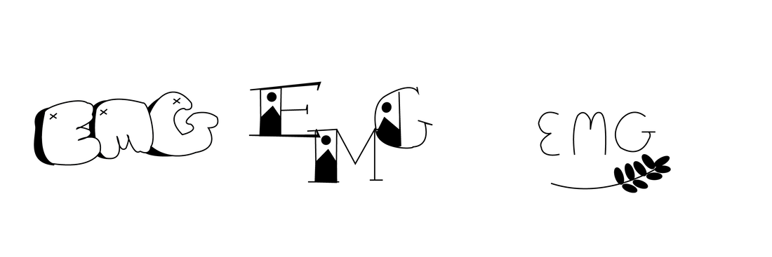
Monogram Set
|
Inspiration: For the first monogram, I was inspired by graffiti art. For the second, I kind of had the idea of type writing style of design with a little twist. And for the last, I was inspired by my own handwriting and added a little flower at the bottom.
Reflection: I definitely learned a lot more about the different tips and tricks in Illustrator. One thing I would take away is the shapes of the petals of the flower in the third monogram. Instead I should've made a custom shape instead of using the shape tools. |
Business Cards
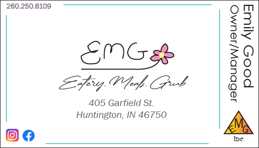
Eatery, Meals, Grub |
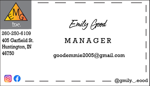
EMG Inc. |
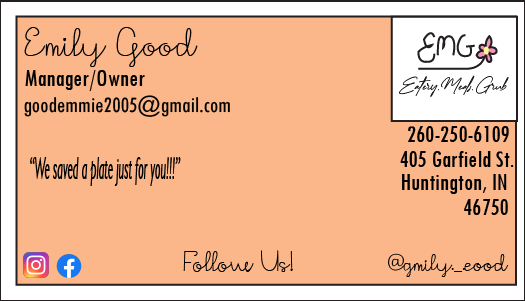
Personal Card |
Inspiration: For the first card, I wanted something cute and fancy, so I went with the idea of a family-owned restaurant business card. For the second one, I went with a more crafty card and got the name EMG Inc., which is inspired by business suppliers. For the last one, I went with the fancy restaurant again with more color and more information.
Reflection: This one was my favorite project we did, I showed a lot of creativity in this and even added the Instagram and Facebook logos. My favorite out of the three is the third one because I love the color, I love the fonts I used, it's just super pretty. One thing I take away from this was the struggle I had with alignment and where I was going to put things.
Reflection: This one was my favorite project we did, I showed a lot of creativity in this and even added the Instagram and Facebook logos. My favorite out of the three is the third one because I love the color, I love the fonts I used, it's just super pretty. One thing I take away from this was the struggle I had with alignment and where I was going to put things.
Sticker Set
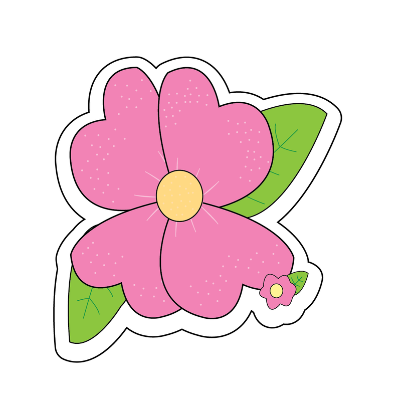
Flower Sticker |
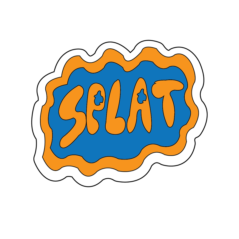
"Splat" Sticker |
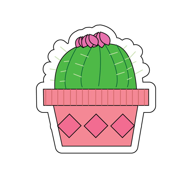
Cactus Sticker |
Inspiration: For the flower, I just used my go-to design I use for ceramics class, and I wanted to see want it would look like as an digital design. For the "SPLAT" sticker, I was inspired by 90's Nickelodeon; I used bright colors such as orange and blue to get that nostalgic feeling. For the cactus, I was inspired by people's love for plants, it's just aesthetically pleasing.
Reflection: Definitely a lot of improvement on this. I learned how to make an outline for the stickers and definitely mastered most of the common tools. I think something I would change would be the lines coming out of the middle of the flowers and make them more curved.
Reflection: Definitely a lot of improvement on this. I learned how to make an outline for the stickers and definitely mastered most of the common tools. I think something I would change would be the lines coming out of the middle of the flowers and make them more curved.
Social/Political Poster
|
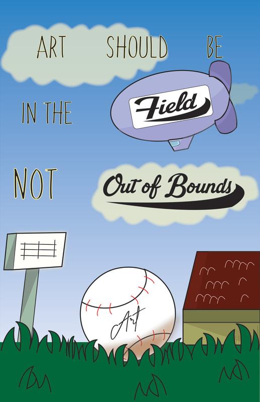
Inspiration: My inspiration for this was how most art programs in schools are financially struggling, while sports finances are rocketing. I feel like it's unfair to those who prefer the arts over sports, because they are losing their chances at being creative, and finding themselves. "Art should be in the field, not out of bounds" is phrase meaning that people should donate and support people who like art and do it for a living, other than sports.
Reflection: I think my decision of doing a cartoon poster was going the safe route, rather than trying to figure out Photoshop. I like the fonts I used, it matches the aesthetic of the poster. I also really like how incorporated shadowing to the poster, it adds more depth and more dimension to the poster. |
|
Package Design
|
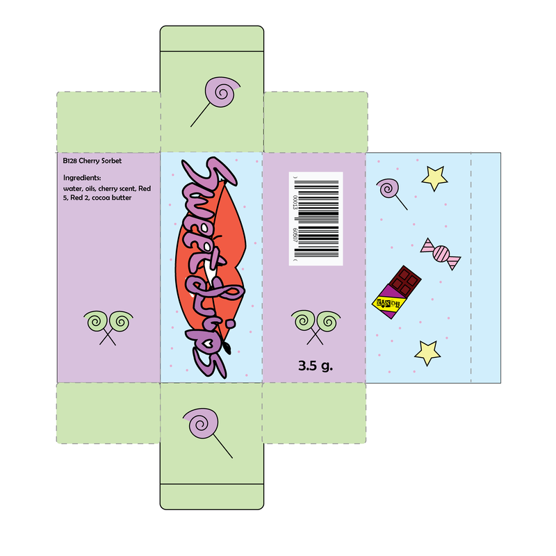
Inspiration: I was inspired by my love for makeup and my brother favorite thing, candy! For the chocolate bar on the back cover, the logo on it says "Kandy" which is inspired by the candy in the episode "Rock Bottom" from Spongebob Squarepants. And of course, since I like makeup, I chose to make a lip balm package, hence the logo "Sweet Lips."
Reflection: I really like the color palette I chose. I think it really fits the candy theme for the box. The font for the "Sweet Lips" logo is my own work, I really like the style I used, and I like the way it matches the color, plus the lips really add that contrast this is needing. |
|
Album Cover/Entertainment Design
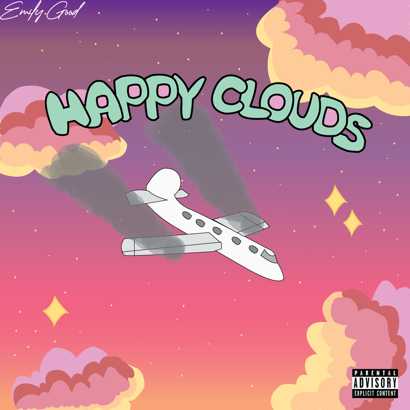
Inspiration: My inspiration for this was from my favorite artist, Wilbur Soot and his band, Lovejoy. I really enjoy their music and really like the indie rock style. The song list I made is also inspired by the creative ways they name their songs.
|
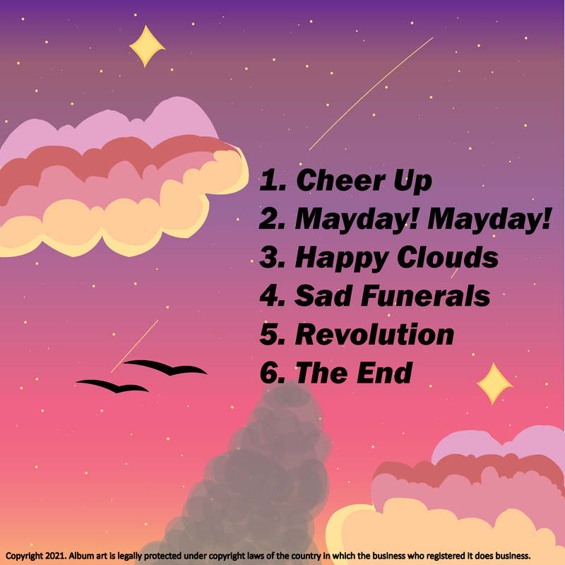
Reflection: Some things I can look back on with this design is how trendy it looks. Indie rock is the pretty popular choice for music, so I tried my best to get that more rougher and hard-edge look just like other indie rock covers.
|
